Reading time: 12 min.
The role of colors and typography in the premium segment
In the premium segment, it is not only the product that shapes the perception of value and exclusivity, but above all its visual design. Colors and typography are key carriers of brand identity, sending subtle signals that convey luxury and quality. But what makes a choice of color or typeface truly stand out in the luxury context? And how can premium brands respond to modern trends without losing their timeless elegance?
This article explores current color and typography trends in the luxury market and explains how visual codes contribute to an emotional brand experience.
1. Color psychology in the premium segment – beyond aesthetics
Colors are emotional messengers. In the premium world, they symbolize values such as exclusivity, tradition, quality, or innovation.
Current luxury color trends:
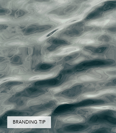
- Deep jewel tones: Emerald green, ruby red, sapphire blue, and amethyst violet convey opulence, craftsmanship, and elegance. These rich shades create depth and a refined, luxurious radiance.
- Neutral classics: Warm beiges, creamy ivory, and cool greys embody understatement, calm, and timelessness.
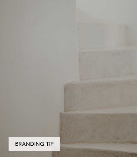
- Metallic accents: Gold, platinum, and copper highlight value and glamour – without excess.
- Sustainable colors: Earthy tones like moss green and terracotta reflect the growing trend towards sustainable luxury.
Role in brand identity:
Premium color palettes are typically reduced, harmonious, and highly distinctive. Brands that consciously select colors reflecting their history and values achieve consistency and recognition – without appearing fleeting or overly trend-driven.
2. Typography – the voice of a premium brand
Typography is a brand’s visual voice. In the luxury segment, it underscores uniqueness and authority, while shaping the perception of quality.
Typography trends in premium branding:
- Serif fonts: Serif fonts: Classic, elegant, and timeless – serif fonts embody tradition, stability, and trust. Much like gold in the luxury world, they are continually reinterpreted in modern ways, often with finer lines and generous spacing.
- Geometric sans-serif fonts: Minimalist and contemporary, fonts like Avenir Next or Futura are widely used in modern luxury design, especially by innovative premium brands. They radiate clarity and a forward-looking elegance.
- Custom typefaces and calligraphic accents: Bespoke fonts or handwritten-style lettering add individuality and exclusivity, strengthening recognition and giving a brand its own distinct voice – whether in logos or editorials.
- Variable fonts & custom families: More luxury brands are developing entire font families tailored precisely to their identity. This ensures flexibility across media while offering a high degree of recognition and uniqueness.
3. Harmonious interplay of colors and typography
In premium brand communication, the key lies in perfect synergy: colors and typefaces are combined to complement and reinforce each other.
Contrasts are used with sophistication: for example, a rich jewel blue paired with a refined serif font in gold creates a sense of luxury and distinction.
Typography reflects the brand’s personality – whether warm and inviting or cool and minimalist.Like color, typography follows the brand’s guiding principle – whether warm and inviting or cool and minimalist.
White space and thoughtful layouts give colors and fonts room to breathe, amplifying their emotional impact.
4. Digital trends and challenges in the premium segment
Digitalization pushes luxury brands to translate their visual codes into online formats – with both technical limitations and creative opportunities.
Colors on screen: Bright, luminous shades appear more radiant digitally but can quickly feel harsh. Subtle gradients and textures are often used to preserve sophistication.
Typography online: Typefaces must be both legible and refined across devices. Variable fonts open up new possibilities for adaptable, elegant brand expression.
Motion and micro-animations: Animated surfaces and kinetic typography are gaining importance, adding depth and dynamism without compromising eleganc
5. Outlook for the future: Which visual codes will shape what’s next?
Sustainability as a visual statement: Natural and organic tones, bio-based materials, and tactile effects are increasingly becoming key elements of luxury aesthetics.
Hybrid typography: The fusion of classic and digital, tradition and innovation, will continue to influence typeface and logo design, creating identities that feel both rooted and forward-looking.
Multi-dimensional design: Layering with transparency and 3D effects opens new avenues for deeper, more immersive visual experiences.
Conclusion
Color and typography trends in the premium segment go far beyond questions of style – they are essential tools for turning luxury into an emotional experience. Successful brands master the art of linking these visual codes with their identity, ensuring they remain timeless while staying modern and relevant.
The result is a visual language that does more than catch the eye – it makes the values and aura of a brand tangible and emotionally perceptible.